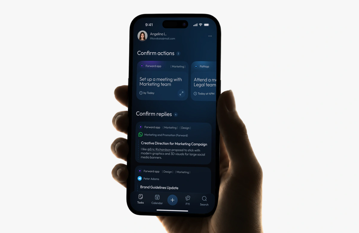
Nutrition

A lab-based nutrition plan, turned from a one-time read into a daily habit.
1 tap from a recommendation to action
5 metrics, each labelled by confidence
From a plan read once to a daily habit
A nutrition plan built on the user’s own blood work was opened once and never again.
I redesigned it into a daily habit: every recommendation collapses into a single tap, and the streak rewards coming back rather than being perfect.
- Role
- Product designer: PRD, behaviour model, interaction design, design system in Figma
- Outcome
- A system built to be measured: five metrics, each with a target and a confidence label
- Platform
- Mobile app, the nutrition pillar of a consumer health-tech product
- Status
- Redesign, before production data · 2025
At a glance
Problem
The plan said what to eat and why, then stopped. Nothing to do today, no reason to come back tomorrow.
Solution
Three kinds of target, each with its own one-tap mechanic, and a streak for showing up, not for being perfect.
Result
No production data yet. Five metrics with targets, each labelled by how sure the forecast is.
The problem
People ordered a blood panel, got a plan built on their own markers, read it once and never came back. The plan was clinically accurate and, as a product, dead: it said what to eat and why, and gave no reason to return tomorrow.
The hard part: these people already know sugar hurts them. The gap isn’t knowledge, it’s the step from “eat salmon three times a week” to an actual dinner.
Key decisions
Credit without capture
No food logging, no portions, no calories. Research shows tracking adherence falls after week two and heavy tracking harms part of this audience, so one tap replaces the diary.
Three targets, three mechanics
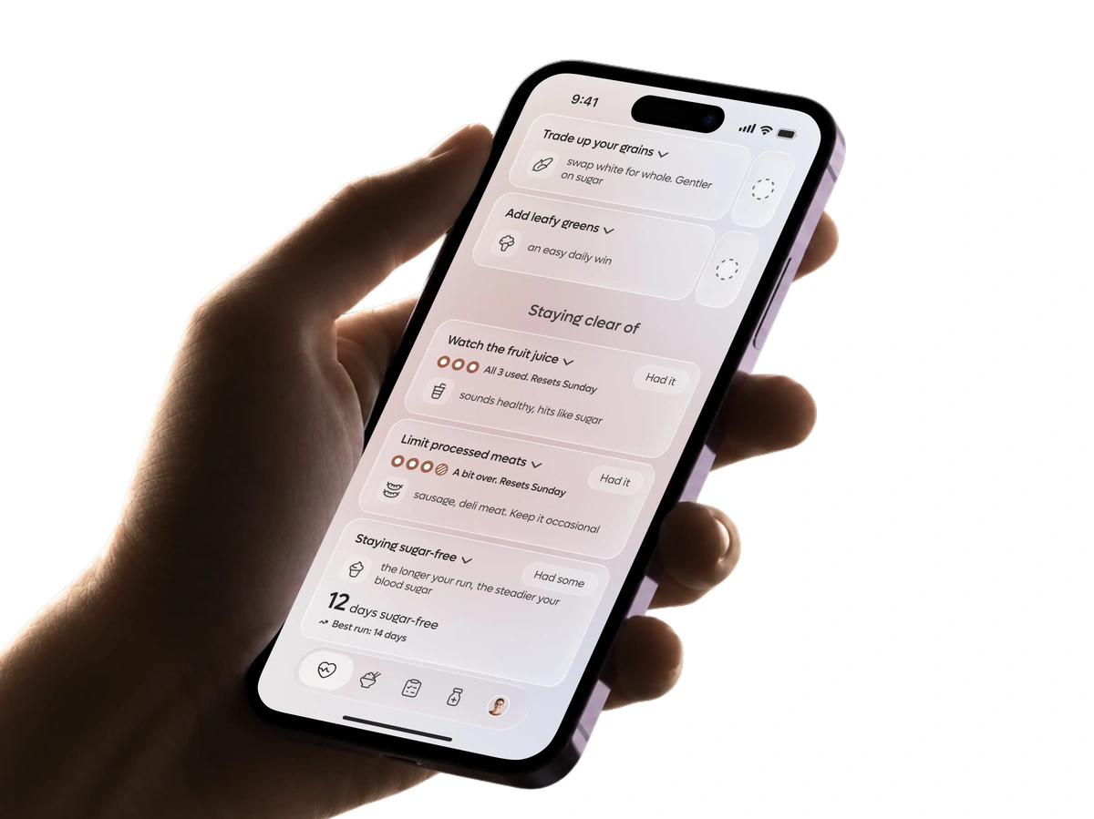
Build gets a tap and a checkmark, Reduce spends a weekly budget, Eliminate counts clear days on its own. “Eat salmon” and “don’t eat sugar” are different behaviours, so they can’t share one gesture.
A streak for returning, not for perfection
Logging a slip is engagement and doesn’t break the streak. Otherwise honesty becomes the most expensive action in the app.
Plain reason first, clinical tags one tap away
The card says “to keep your sugar steady”; HOMA-IR and the full rationale live in the expanded state.
A system, not mockups
Components with variants for each class, variable collections as one source of truth for copy and languages, a PRD with edge cases for engineers.

Forecast targets, not measured yet
≥40%
open the tab 4+ days a week
≥60%
of daily Build targets done
≥55%
still building the habit in week 2
What I’d do differently
Test the Eliminate reset earlier
For an episodic food like added sugar, “26 of 30 days clean” may be more honest than a reset to zero.
Ship minimal analytics first
Two events, “opened the pillar” and “checked a target”, would replace the daily-return forecast with fact in the first week.
[001] Context and problem
Opened once, never again
The product works like this: you order a blood panel, and the app reads your results to tell you what to change in food, movement and lifestyle for your specific markers. This isn’t abstract wellness. Its audience needs a lab-based plan not to optimize, but to avoid tipping into a diagnosis.
The client came with a concrete problem: users don’t come back to the nutrition section. And nutrition is arguably the most important section in the app, because it moves the very markers people took the test for. I was asked to find out why, and to propose what to do about it.
The pillar was accurate and, as a product, dead. It said what to eat and why, showed marker tags on every card, and stopped there. Meanwhile it sat on an asset no competitor has: the user’s own biomarkers, already attached to every recommendation. What was missing wasn’t content. It was a loop that turns content into behaviour.
The design challenge
Not “explain it better”, but cut the friction between a recommendation and an action down to one tap.
[002] Empathise
A plan read once and closed for good
People took the panel, got a personalized plan, opened the app once and never returned. Not because the plan was bad: it said precisely to eat more fibre and less white bread, and showed which markers sat behind that advice (HOMA-IR, hsCRP, TG:HDL). People read all of it, nodded, and closed the app for good.
The problem isn’t knowledge. People on this plan already know sugar hurts them. The problem is that “eat salmon three times a week” never turns into an actual dinner, and that friction is where the product lost them every day after the first.
[003] The strategic call
Why I designed away from trackers
The obvious move for a nutrition product is tracking: log your food, count calories and macros. I proposed the opposite, and that call rests on evidence rather than taste.
Tracking doesn’t hold, and that’s been measured
In a randomized trial (Burke et al., Obesity, 2011) adherence to self-monitoring peaks in week two (96 to 97% in the digital arms) and starts falling from week three. A later analysis of two randomized trials found fewer than half of participants still tracking after week ten. Consistency explained the largest share of variance in outcomes (R²=0.27, P<0.001).
Heavy tracking harms part of the audience
In a clinical sample of 105 people with diagnosed eating disorders (Levinson, Fewell & Brosof, Eating Behaviors, 2017), 73% of MyFitnessPal users said the app contributed to their eating disorder. For a product with clinical positioning, that’s an unacceptable side effect.
The market has already moved
There’s a visible shift from counting numbers toward food quality and intuitive eating, and research shows comparable or better long-term outcomes at a fraction of the psychological load.
From that I derived the product’s position: credit without capture. One tap instead of logging. No food search, no portions, no numbers to be judged on. An active study (MySnackTracker) is built on the same hypothesis: abbreviated tracking beats full tracking on adherence and satisfaction.
Before designing the interface, I ran a session with the client: their current problem, the evidence against strict food tracking, and my direction, talked through out loud. Moving from tracking to a light assistant is a strategic decision, not an interface detail, and it needed agreement before I spent time on screens.
[004] My role
Problem framing to final design
I owned the nutrition pillar from problem framing to final design in Figma.
Wrote the PRD
Competitive analysis, differentiation, requirements prioritized by value and effort, metrics with honest confidence labels, edge cases and failure modes.
Chose the behavioural model
COM-B over product-world habit frameworks, and defended that choice.
Designed the core solution
Three behavioural classes of target, each with its own interaction model.
Decoupled the streak from perfection
The contentious call, justified by the economics of honesty.
Built it in Figma
Design system, components with variants, variable collections for copy and languages, and the AI pipeline that made all of it faster.
[005] Highlights
Goals, honestly labelled
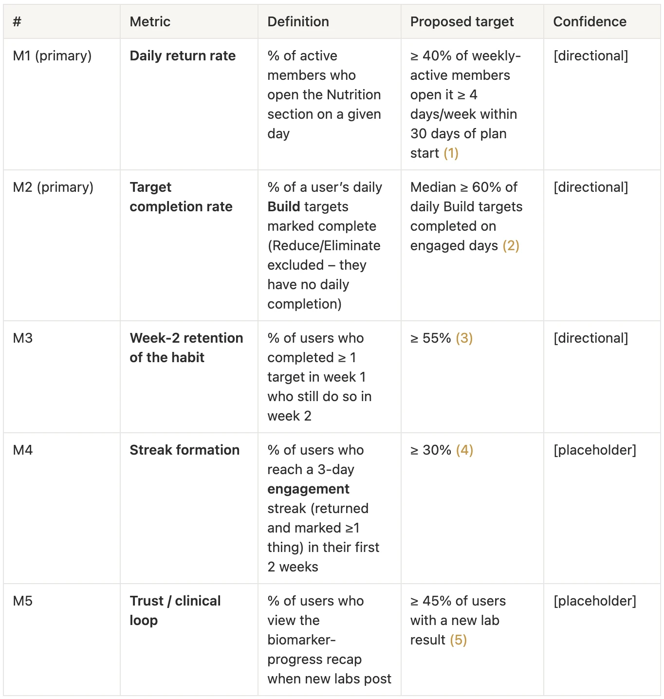
The pillar hasn’t collected production data yet, so there are no real retention numbers to quote. The impact here isn’t “retention up N%”: I designed the system so it can be measured honestly, and gave a forecast I can defend to a sceptic.
Each metric is labelled directional, where I’m confident in the direction and the value sits in a defensible range against external data, or placeholder, where it’s a reasoned guess with no benchmark. Streak formation and the lab-results trust loop have no public benchmark, so they stay placeholders until the first measurement.
Forecast targets, directional, not measured yet
≥40%
daily return
Weekly actives who open the tab 4+ days a week. Top fitness apps see about 47% among engaged users.
≥60%
target completion
Median share of daily Build targets done on engaged days. Completion is one binary tap.
≥55%
week-2 habit retention
The best-supported target: users with a 7-day streak retain 2.3 to 3.6× better (Duolingo).
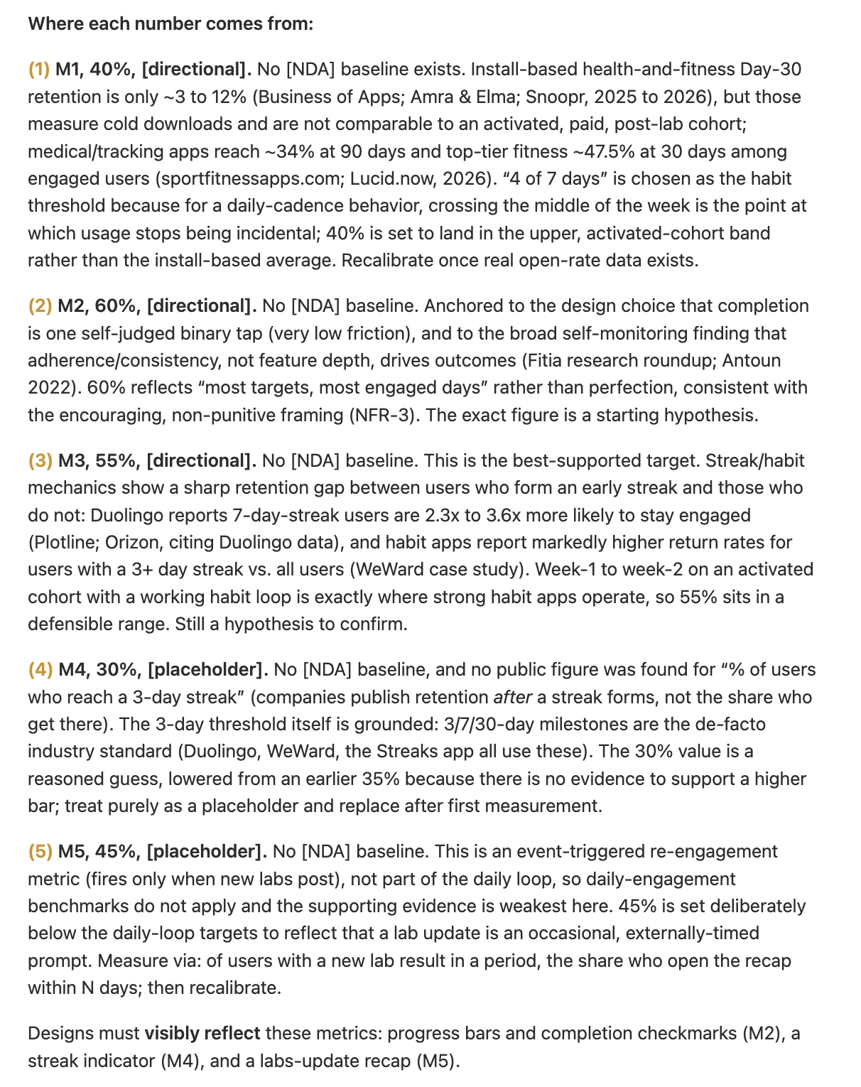
A metric that isn’t visible on screen is a metric people forget to measure.
So I required the design to surface them: progress and checkmarks for target completion, the streak indicator for streak formation, a recap when new lab results land for the trust loop.
[006] Ideate
Why I passed on habit frameworks
When you design for habit, your hand reaches for Fogg, the Hook Model, the habit loop. They share one blind spot: they explain how to trigger a behaviour, not why the person isn’t doing it yet. For these users awareness was never the problem, and “trigger first” would have meant notifications and rewards that don’t move the metric.
I took COM-B (Behaviour Change Wheel, Susan Michie’s group, UCL) for its evidence base and its fit with clinical territory. Its diagnosis was immediately a product diagnosis: the old tab zeroed out all three conditions for behaviour.
Capability
Read-only: you can’t act inside it.
Opportunity
No reason to return at the right moment.
Motivation
“I did it” never meets “the marker moved”.
Remove any one and the behaviour doesn’t happen. The theory became a checklist of what the redesign had to fix.
[007] The best part
One diagnosis, three different medicines
I didn’t like the first iteration of the cards, and worked out why: I was treating different behaviours with the same medicine. “Eat salmon” and “don’t eat sugar” aren’t one mechanic with different copy. Tap-and-reward works for an action you can repeat. For a non-action there’s nothing to repeat, and a daily “I didn’t eat sugar again” tap is friction plus an incentive to hide a slip.
So I went to the most worked-out “stop doing X” category there is, smoking cessation and moderate-drinking apps. Three classes came out of it.
[007] The best part · Build
Build: add something good
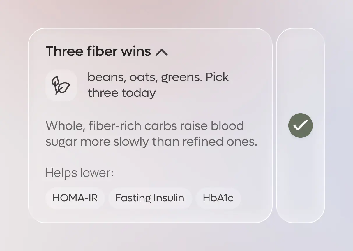
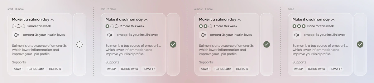
Fibre, protein at breakfast, salmon. There’s a concrete action to repeat and reward. Tap means done, and a checkmark appears. Daily targets reset at midnight; weekly ones accumulate across the week. This is the core of the habit.
[007] The best part · Reduce
Reduce: a cap above zero
“Processed meat no more than 3 times a week.” A weekly budget, borrowed from the moderation app Sunnyside. “Had it” spends one unit. We count days, not portions: we deliberately don’t collect quantity, and “days with the food” is an honest unit.
Reaching the cap and going over it get neutral copy, “All 3 used” and “A bit over. Resets Sunday”, never red, never shaming.

[007] The best part · Eliminate
Eliminate: a cap of zero
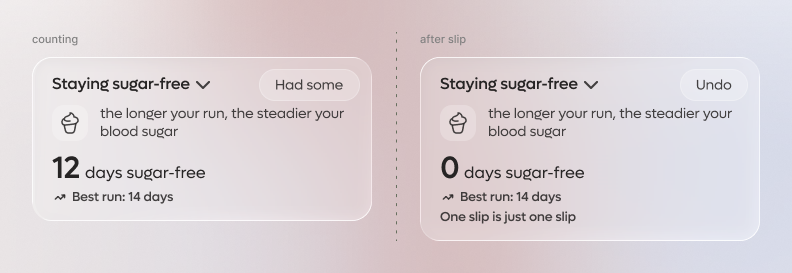
“No added sugar.” A rising day counter, the “days without cigarettes” pattern. It grows on its own from a start date, with no daily tap and no checkmark, because abstinence is the default state, not something you confirm every day.
The only action is a quiet “Had some” for a slip. It resets the counter gently and keeps your best run on the card, because one slip is just one slip.
The rule on top
Replacing a bad action with a good one builds a habit. Filing a daily abstinence report doesn’t.
Wherever a restriction has a natural substitute, I reframe it from Eliminate to Build: “avoid white rice” becomes “choose whole grains over white rice”. Eliminate stays only where there’s no substitute, like added sugar.
[008] Usability study
Testing the three classes
Sessions focused on whether the mechanics read as distinct without explanation: that Eliminate grows by itself while Build needs a tap, and that the Reduce budget isn’t an ordinary to-do. They did, and the sessions showed where copy and card states needed tuning.
A streak for returning, not for perfection
A standard streak breaks the moment you miss a goal. If it breaks on an honestly logged slip, honesty becomes the most expensive action in the app, and the product teaches people to hide slips. So the streak counts returning: logging a Reduce overage or an Eliminate slip is engagement and doesn’t break it. Only not showing up does, and then the reset is soft and encouraging, not a guilt screen.
One decision covers two requirements: it closes the eating-disorder risk in a clinical context and keeps the data honest for when it’s tied back to lab results.
What I kept off the first screen
I overruled my own earlier version. I first required biomarker tags to be visible without a tap, for trust. In practice a raw “HOMA-IR” means nothing without medical training and clutters the daily screen. Now the preview carries the reason in plain language, and the clinical tags with the full rationale sit in the expanded state. I logged it as an explicit revision in the PRD, so the decision and its reasoning stayed visible to the team.
[009] Design approach
How I used AI in this work
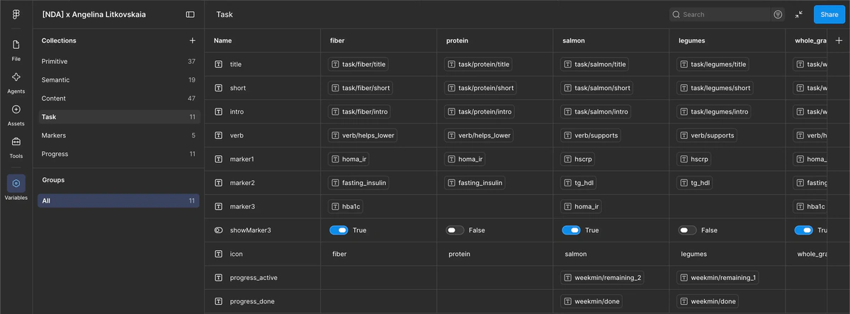
I built a working pipeline, not one-off prompts. The brief and screenshots turned into a full PRD through a skill set up for that structure. Through Claude Code I stood up the starting design system in Figma and the variable collections that switch card content and whole screens between languages. Copy for every card type came from one source of truth.
The limitation I worked against isn’t speed. AI reasons very persuasively inside the frame you give it and almost never questions the frame.
My PRD said every goal is checked off with the same tap, and AI designed onward from that premise. The error was mine: “eat greens” and “don’t eat sugar” are opposite actions, and one gesture breaks one of them. I stopped, reframed the problem, and checked it by changing the criterion: how is “stop doing X” solved in smoking and alcohol cessation apps? The hypothesis held, in details I hadn’t anticipated.
Clinical attribution got the same caution. “You stayed sugar-free 26 of 30 days and your HbA1c improved” slides easily into a causal promise the data can’t carry. The adherence signal comes from data we already collect, and attribution wording goes to health-team review wherever causality isn’t proven.
[010] Final design
A system, not mockups
What I left behind is a system: components with variants for each behavioural class, variable collections as one source of truth across languages, a PRD with prioritization and edge cases as a contract for engineers, and a list of push notifications and toasts. The next person continues from an index instead of reverse-engineering my mockups.
[011] Key takeaways
What I’d do differently
I under-cooked the Eliminate reset
A hard “days without cigarettes” reset may be too harsh for an episodic food like added sugar, where “26 of 30 days clean” is more honest than zeroing out. It’s one line of logic but it changes how the product feels, and I could have tested both forms with users earlier.
The forecast rests on external benchmarks
There’s no first-party data yet. That’s the right move under uncertainty, but any of these targets could fall apart at the first real measurement, so I designed them as hypotheses to be disproved.
Next step: ship minimal analytics first
One “opened the nutrition pillar” event with a date and one “checked a target” event. Within the first week we’d see the real return curve and replace the daily-return forecast with fact.
Next cases