
Forward
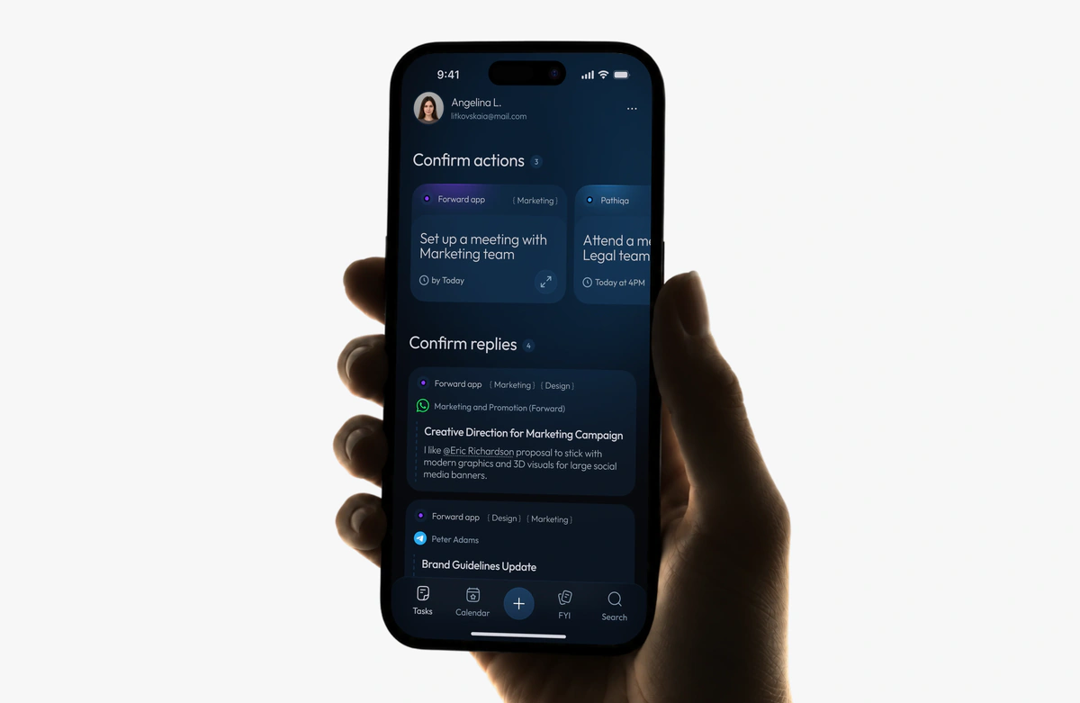
AI assistant that gives every decision an owner, options and a deadline.
+31% more confident choices
+35% clearer next step
Turning a stream of messages into a stream of decisions
Forward finds the decisions buried in email, chat and meetings and gives each one an owner, options and a deadline.
I was the only designer and built it from zero, from the first screens to a closed beta on people’s real email.
- Role
- Sole product designer: research, design, React prototype
- Outcome
- +31% confidence in the choice · +35% clarity on the next step
- Team
- Founder & PM · 4 engineers · product designer
- Status
- New product, pre-launch, closed beta with 41 people · 2026
At a glance
Problem
Decisions get lost in threads and calls, and the advice comes from a model that can be wrong.
Solution
One card per real decision, options that show how sure the model is, and drafts a person sends.
Result
Far fewer people read the model’s estimate as a promise: 19% instead of 54%.
The problem
Tasks live in project tools, customers in CRMs, code in Git. But the moment someone weighs options and commits gets lost in threads and calls. Forward finds these decisions in email, chat and meetings and gives each one an owner, options and a deadline.
The hard part: people decide between meetings, on a phone, on the advice of a model that can be wrong.
How I checked it
Usability test, 7 people
Same decision made twice, from screenshots of chats and then in Forward. Both ratings came out about a third higher in Forward, enough to build a beta.
Closed beta on real Gmail, 4 weeks
56 people started, 41 finished. About 32 hours of interviews I ran myself.
“What did you decide?”
One evening push with one-tap answers. It was the only way to see where the model had been confidently wrong.
Key decisions
One card, one decision
I set the rule for what a card holds: one judgment call, with the work that follows kept inside as a checklist, so Forward doesn’t turn into one more task manager. 66 of 80 items in people’s own feeds matched how they sorted them themselves.
A stream you can clear between meetings
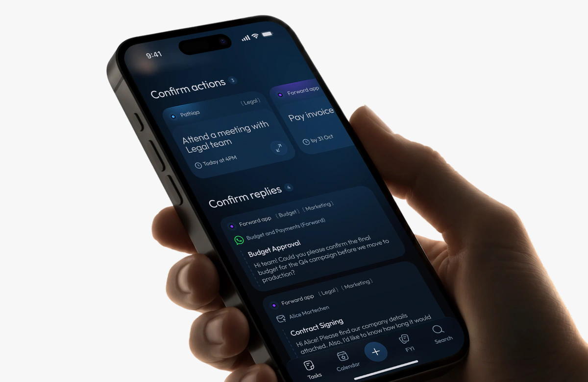
Short action cards on top, drafted replies below, a long press to act without opening.
A guess that shows its reasoning
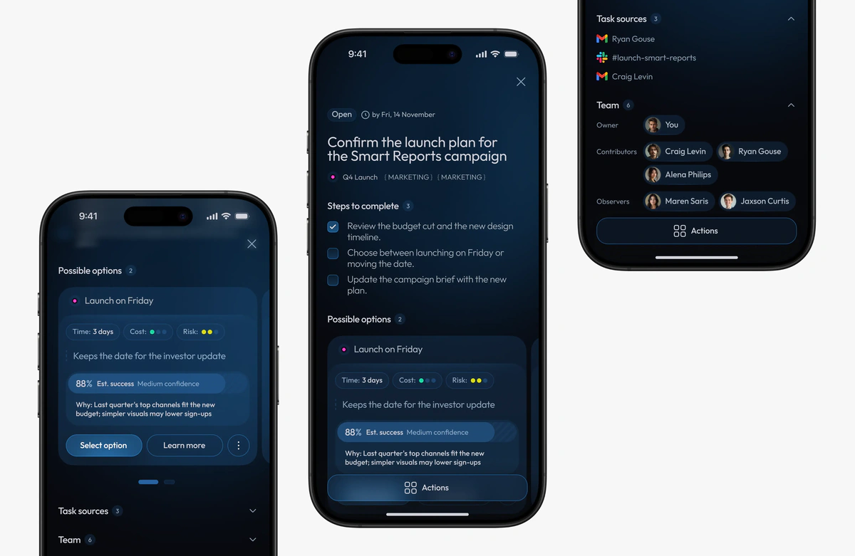
In v1 people read the model’s estimate as a promise. In v2 the card says how sure the model is and what the guess rests on, with one plain outcome instead of a list of benefits.
Three exits for disagreement
Other options, the messages behind the card, and a chat scoped to this one decision.
Forward prepares, a person sends
Every reply is a draft and every option waits for a tap.
One source for design and code
Figma variables and components, documented in Storybook. I moved design changes into the beta app myself with Claude Code.
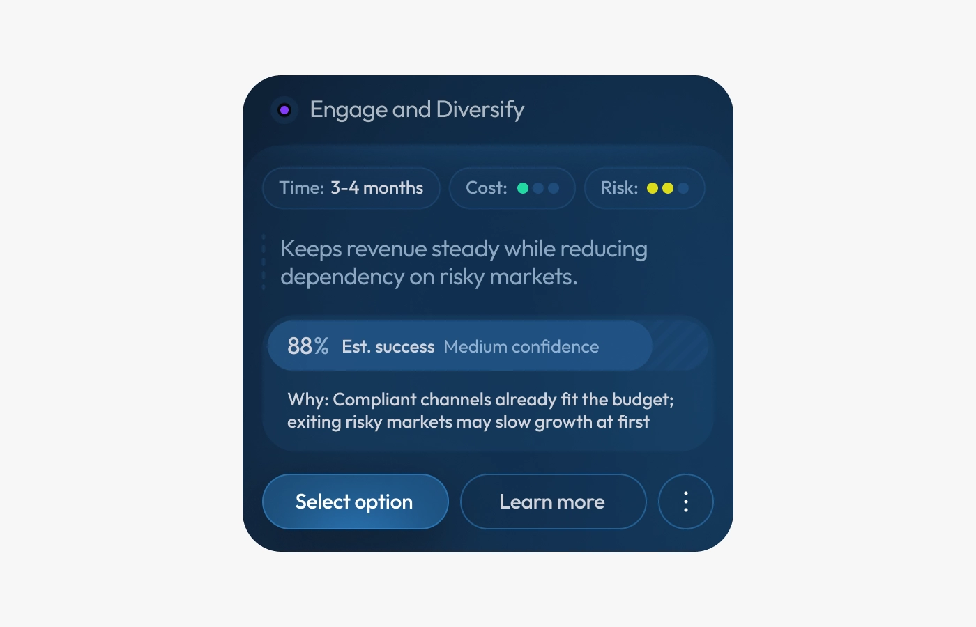
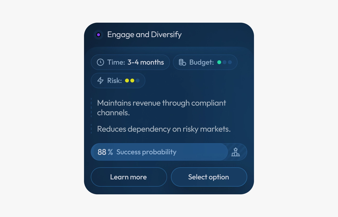
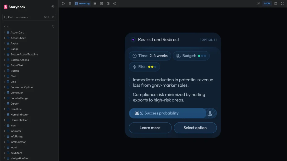
The option card, v1 → v2, measured on the same people before and after
+31%
confidence in the choice
+35%
clarity of the next step
54% → 19%
read the model’s estimate as a promise
The product across the beta
- 84%
- of cards were real decisions, not tasks
- 4 days a week
- median return, against a target of 3
- 64%
- of drafted replies were sent
- 43%
- of those who finished would be very disappointed to lose Forward
What I’d push on next time
Some problems only show up on real data
On made-up email nobody cared who decides. On their own, they did: 8 of 14 disagreements with the rule were about it. So now the card changes depending on who opens it.
Owning the code made the results possible
I shipped the new option card into the beta myself in week 3, so we could compare both versions on the same people: +31% and +35%.
Ask people to explain, not to rate
One open question, “What does 88% mean?”, showed that 54% read it as “it will work”. A 1 to 7 score would have missed it.
The best brief was the model’s mistakes
Real errors, not average accuracy, showed what to design. The most common, 14 of 46, was a decision made on a call Forward never heard. So confidence now stays at Medium when a meeting is missing.
[001] Context and problem
A decision has no data model
Tasks live in project tools, customers in CRMs, code in Git. But the moment someone weighs options and commits gets lost in threads and calls.
Forward gives each decision a home. I designed the whole loop, from connecting your inbox to choosing an option.
The design challenge
Design for a person between meetings, holding a phone, who has to resolve something with real consequences on the advice of a model that might be wrong.
Consequence
These aren’t checkboxes. A wrong choice costs money, time or a relationship.
Uncertainty
The model’s output is a probability, not an answer. The interface has to be honest about that without becoming useless.
Closed beta, option card v1 and v2
+31%
confidence in the choice
+35%
clarity of the next step
−65%
read the model’s estimate as a promise
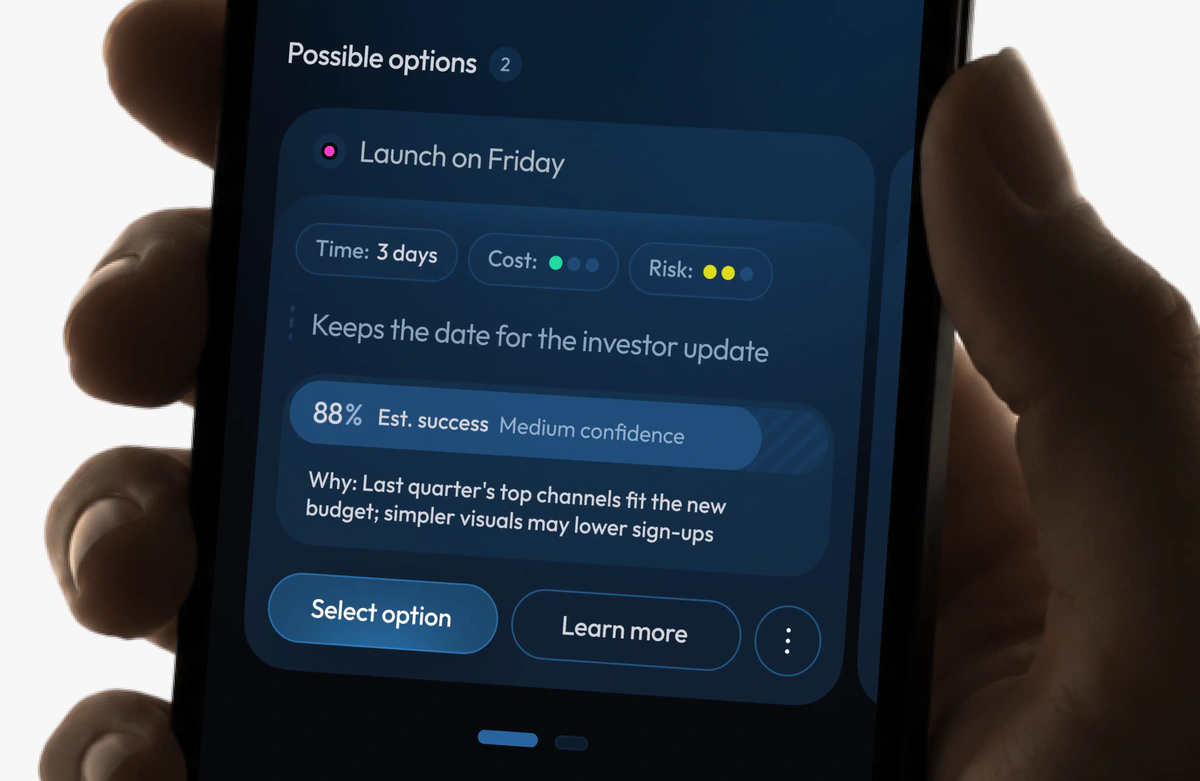
[002] Constraints
What I had to design around
A new product built from zero, one designer, and a model nobody could promise was right. These shaped every screen.
From zero, one designer
No existing product, patterns or design system to lean on. Everything had to earn its place in the first version.
A model that can be wrong
A rule from the start: no decision is made without the user’s confirmation.
Phone first
No room for nested trees, long text or two equal buttons.
[003] Research
Two rounds: made-up data, then real email
First I checked the idea on a prototype with made-up data. Then the beta checked it on people’s own Gmail for four weeks.
Usability test, 7 people
3 product managers and 4 marketing leads made the same decision twice: from screenshots of three chats, then in Forward. Both ratings, ease of deciding and clarity of what to do next, came out about a third higher in Forward. On made-up data that was a reason to build the beta, not proof.
Closed beta, 56 people, 41 to the end
Product managers, founders, marketing leads and consultants with at least one project that runs through Gmail.
What I ran myself
First-open sessions where people opened Forward for the first time and thought aloud, mid-beta and final interviews, and calls within a day or two of a confident error. About 32 hours of interviews in four weeks.
Asking what happened
The model can’t see what happened after a deadline, so each evening one push asked “What did you decide?” with one-tap answers. That is where the confident errors came from.
How the beta ran
Recruiting. 144 personal invites, 83 met the criteria, 60 invited, 57 connected Gmail. Friends forgive a rough product, so interviews were run by someone other than the person who invited, surveys asked what people did rather than what they liked, and behaviour metrics came first.
No pay for using it. Paying people to open an app makes the return rate meaningless. Everyone who finished got a free year after launch, and interviews came with a gift card.
One ask a day. Surveys, questions and interview invites were capped at one per person per day. More than that, and a beta feels like a second job.
Privacy. Two engineers could open raw email text, and every access was logged. Everything else was anonymised: “Craig Levin” became [PERSON_1, CEO].
[004] Process and solutions · Decision rule
One card, one decision
The first question was what a card holds. If every piece of work got its own card, Forward would turn into one more task manager, and the stream would fill up with things nobody needs to think about.
So I set a rule: a card holds one judgment call. The work that follows stays inside it as a checklist.
“Venue for the launch event” is a card: it weighs cost, location and who prefers what. Booking the venue and paying the deposit are checkboxes inside it.
The header shows the project and topics the card belongs to, not a tree of parent and child cards: nesting doesn’t fit on a phone.
Checking in the beta
To check where the line falls, I asked 8 beta users to sort 10 items from their own feed: does this need your decision, or is it just something to do? 66 of 80 matched the rule. The 14 that didn’t changed it:
- A step that needs someone’s yes is a decision“Confirm the date with Craig” was a step, but Craig can say no. Steps like this now get their own card.
- The view depends on who’s lookingFor the owner it’s a decision with options. For the assignee it’s a step waiting on that decision.
- People can fix the splitIf Forward got it wrong, the card’s kebab menu (⋮) turns a card into a step, or a step into its own card.
[004] Process and solutions · Main screen
A stream you can clear between meetings
People open Forward between meetings to see what needs them right now. If the stream feels noisy, nothing else matters. So it has two parts, each read at its own speed.
Actions
A carousel of short cards with project, topic and deadline, read in a second.
Replies
Drafted answers, sent back to the same thread.
Done without opening
A long press shows the prepared option, like a slot tomorrow at 14:00.
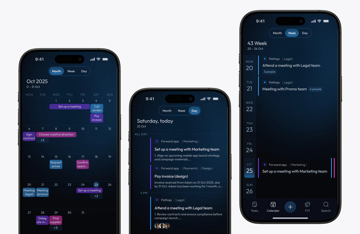
Deadlines in view
The calendar shows the same actions by day, week and month.
[004] Process and solutions · Options
A guess that shows its reasoning
For a hard decision Forward offers a few options, each with the model’s estimate of success, like 88%, plus time, cost and risk. This is where the product earns trust or loses it.
In the beta, v1 of the card had a clear problem: people read the estimate as a promise.
What we heard and what changed
People read the estimate as a promise, so now it shows how sure the model is and why
5 of 8 mid-beta interviewees took the number as “it will probably work”. When a confident option failed, people first asked what it was based on.
Now it reads “Est. success, Medium confidence”, with a short line on what the guess rests on.
Nobody read the list of benefits, so it became one short outcome
“I don’t read this between meetings.”
A list of benefits became one plain outcome tied to the task, like “Keeps the date for the investor update”.
“Budget” confused people, so it became “Cost”
People couldn’t tell whether Budget meant what the option costs or what it saves. Now it says Cost.
No A/B test. With this few people it would mostly show the difference between tasks, not cards: a hard decision takes longer with any card. Instead, the same people rated v1 in weeks 1 and 2 and v2 from week 3, and a Friday survey asked what the estimate meant to them.
A guess the model is unsure about is a different thing from the same guess made with confidence. Showing them the same way would be dishonest.
[004] Process and solutions · Disagreement
Three exits that keep the user moving
A recommendation engine that only handles agreement is a trap. I designed three exits.
Explore Alternatives
Regenerate or widen the set of options.
View Context
Open the emails and messages behind the card and check the model’s homework.
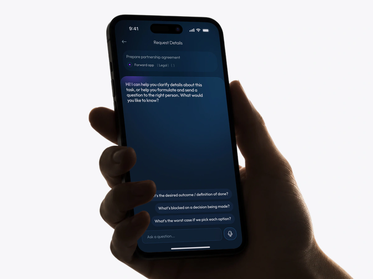
Request Details
An AI chat scoped to this one decision. It knows which decision you’re looking at and opens with a few questions picked for it instead of a blank field. A blank input invites nothing, concrete questions invite a start. Voice input sits in the bar, because this happens between meetings.
[004] Process and solutions · Drafts
Forward prepares, a person sends
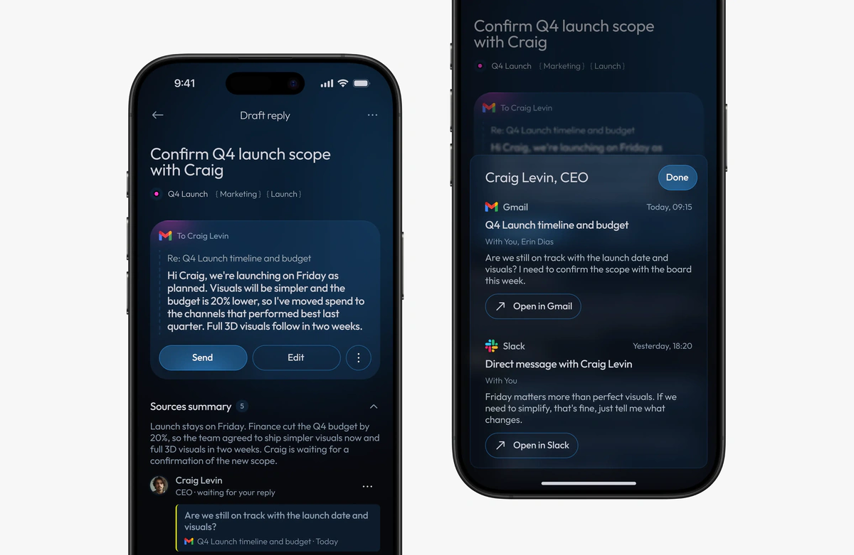
Every reply is a draft, and every option waits for a tap. A model that might be wrong shouldn’t act on its own, least of all in someone’s work email.
So a draft comes with what you need to check it without going back to the inbox. Above it sits a short summary of the thread, and below a summary for each person in it. Open a person to see the exact messages their summary was built from, each with its channel and time.
[005] Design system
A system built for speed, and for code
I used Claude Code to turn the Figma file into a running React prototype and documented the components in Storybook, so design and code share one source.
Variables, components, naming
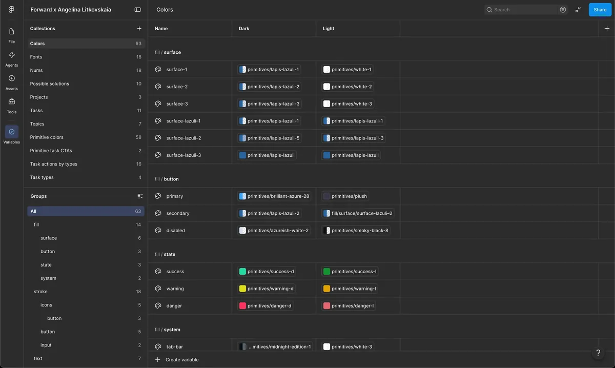
Variable collections for spacing and colour in light and dark themes, a component library with variants, and strict naming: components by function (card-profile, chip), layers by content (action, content), never “Frame” or “Group”. The rules weren’t decoration. Consistent naming is what made the translation into code reliable.
Task content in variables
Each test task was set up once, so the task card in the stream and the opened task always showed the same realistic content. That let me test the React prototype with people early, long before real data.
From prototype to beta app
The prototype later became the beta app, and I kept moving design changes into it myself, without waiting for engineering.
[006] Results
What changed on real email
The option card redesign, measured on the same people before and after.
Option card v1 → v2
+31%
confidence in the choice
Asked right after choosing an option, 1 to 7: 4.9 on v1, 6.4 on v2
+35%
clarity of the next step
Friday survey, 1 to 7: 4.8 on v1, 6.5 on v2
−65%
read the model’s estimate as a promise
Free answers to “what does this number mean?”: 54% on v1, 19% on v2
Most named in final interviews: the Why line
“I can see what the number rests on, and decide if I agree.”
Team results
84% of cards were real decisions after the filter fix (71% before). Median return was 4 days a week against a target of 3. 64% of drafts were sent, half of them almost word for word. 43% of those who stayed would be very disappointed without Forward.
Where it was confidently wrong
The most common confident error was a decision already made on a call Forward never heard about. In the beta, meeting transcripts were uploaded by hand, and cards with one almost never had this error.
So when a thread mentions a meeting and there’s no transcript, confidence now stays at Medium or below, and the card says part of the context was in a meeting.
[007] Key takeaways
What I’d push on next time
Some problems only show up on real data
On made-up email nobody cared who decides. On their own, they did: 8 of 14 disagreements with the rule were about it. So now the card changes depending on who opens it.
Owning the code made the results possible
I shipped the new option card into the beta myself in week 3, so we could compare both versions on the same people: +31% and +35%.
Ask people to explain, not to rate
One open question, “What does 88% mean?”, showed that 54% read it as “it will work”. A 1 to 7 score would have missed it.
The best brief was the model’s mistakes
Real errors, not average accuracy, showed what to design. The most common, 14 of 46, was a decision made on a call Forward never heard. So confidence now stays at Medium when a meeting is missing.
Next cases

